This is a bit overdue but I’ve finally updated this blog’s layout. Here is the list of all the changes so far:
- No more sticky sidebar with my profile picture. Frankly I don’t want to keep looking at it everytime I visit this blog.
- No more images on home page. Even though having the images is nice, I want to make the homepage more minimalistic.
- I’ve added a new hamburger menu for nav bar in mobile view. Yay to CSS.
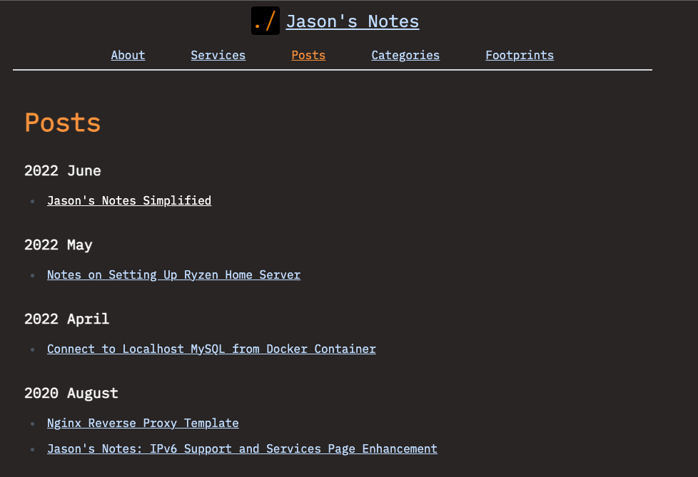
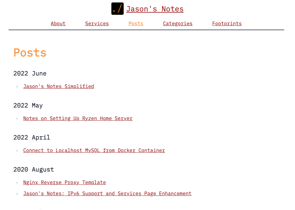
- This blog now is both Light and Dark mode compatible. Try switching your computer’s theme and see which one you like more. I’ve included the images of both versions below. I still have not added the ability to toggle between the two modes. Maybe that’s what I will do next but it doesn’t seem that important to me.
- Migrated from Tachyons CSS to Tailwind CSS. Tailwind CSS provides more robust options to declare dark mode styles inline.
- CSS declaration is more clean and precise (in my perspective).
- I also do some house cleaning to the blog’s infrastructure: removed unused Jekyll’s gems, cleaned up dangling reference from minima theme, etc.
I like how the blog looks now but knowing me, I will eventually have to scratch the itch of updating how the site looks again.
Screenshots
Next Post: About Games
Previous Post: Notes on Setting Up Ryzen Home Server

