Table of Contents
This note goes over how I render the mobile and web view of my site differently to optimize user experience on different screen sizes with the use of @media queries. First let’s examine how it looks on web vs mobile:
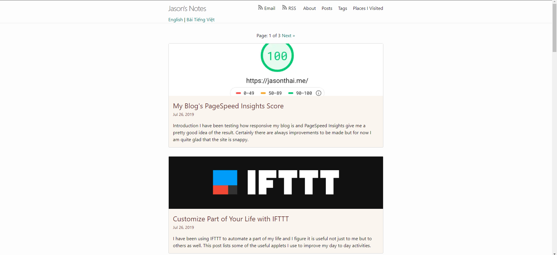
Web View:
This view is designed to be viewed on devices with larger screen like laptops or desktops and it includes more information such as the cover image and description of the post.
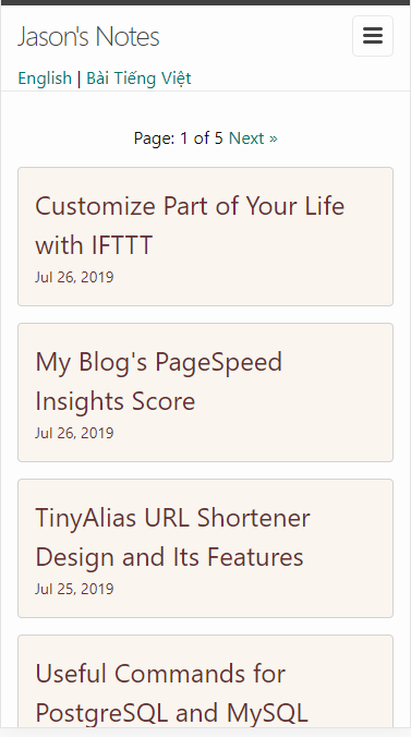
Mobile View:
The view on mobile is optimized a lot more for information browsing. The image and description are eliminated in favor of more number of articles in the view. This makes viewing on mobile devices faster too since the browser does not have to load any images.
How to: using @media
Using @media query, we can define specific css behavior depending on certain width or height of the screen. You can learn more about it here
For example, the following query will apply to device with screen width up to 480px
@media screen and (max-width: 480px) {
  // define css here
}
For my specific site, this is what I define:
@media screen and (max-width: 600px) {
  .bg-img {
    display: none;   // hiding the cover image
  }

  .excerpt p {
    display: none;  // hiding the description
  }
}
Conclusion
Using @media is a simple way to apply specific styles to different media/screens. I believe there are other ways to do it too such as grid or flex view. I am going to take a look at those a different time.